The Audubon Society had built decades of trust in environmental activism–protecting birds and their habitats. But the organization's branding was out of date, and they were looking to refresh their identity without losing their heritage.
The Refined Word Mark
The logo was simplified and refined–borrowing elements from the old branding and improving them.

A Design System with Flexability
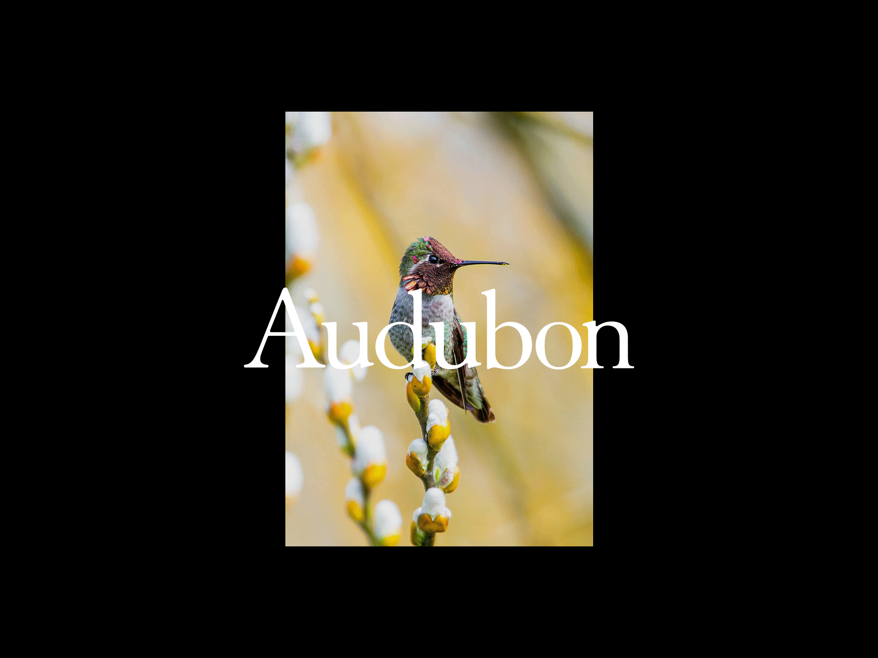
The refined word mark was adapted for a more modern use, giving the brand the necessary flexability.
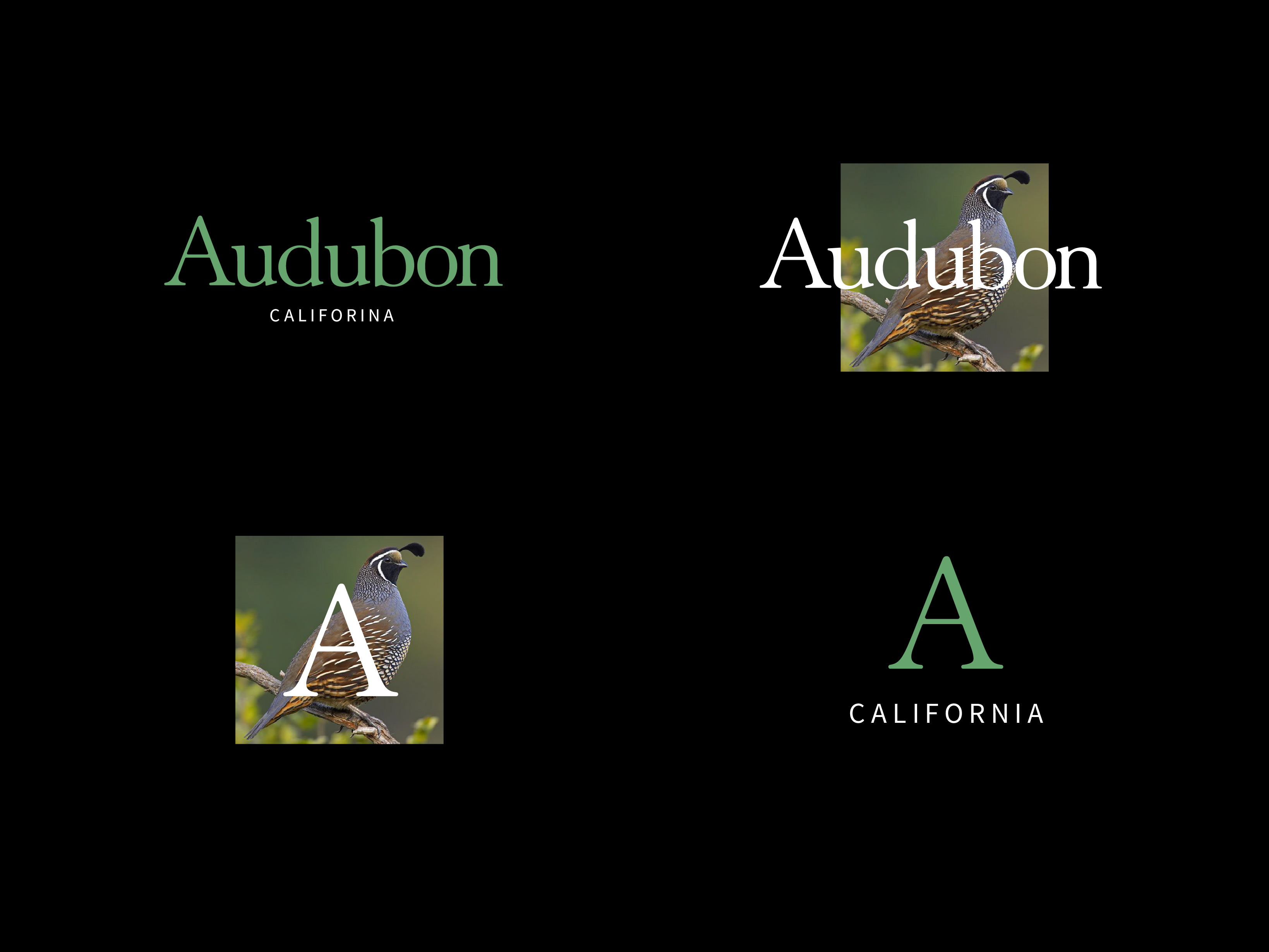
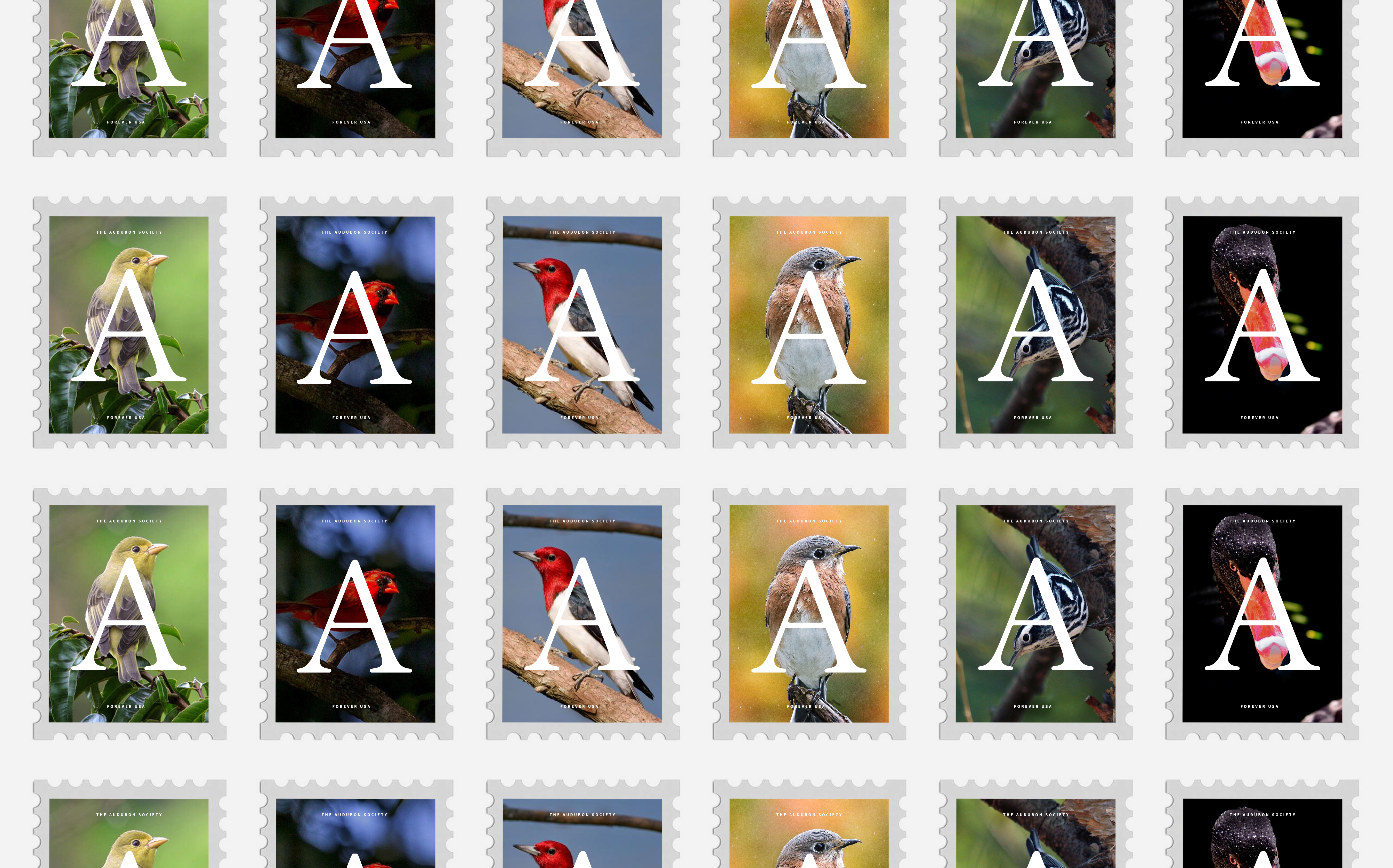
Various images of birds replaced the bird in the old logo. Different crops and sizes added a sense of modernity and informality to the brand.
Modern Colors
A simplified color system of green, white, and black elevated the brand while still giving a nod to the natural world.

Powerful monogram
The 'A' in Audubon also felt like an element worthy of prominence if used correctly. In smaller or more understated use cases, the lettermark stood in place of the wordmark.