In 2017, a well established LA film executive was returning home to Canada with his sights set on reviving Toronto as a go-to location for movie-making. He was building an investment group to acquire Pinewood Studios, intending to refresh its name and identity.
New Logo Mark
The logo consisted of three core elements representing the studio's mission and vision.

Advancement for Artists
Trusted Studio Destination
Duality of Commerce and Craft
The proportions of the mark were set to a 3:2 ratio to match the size of 35mm film.
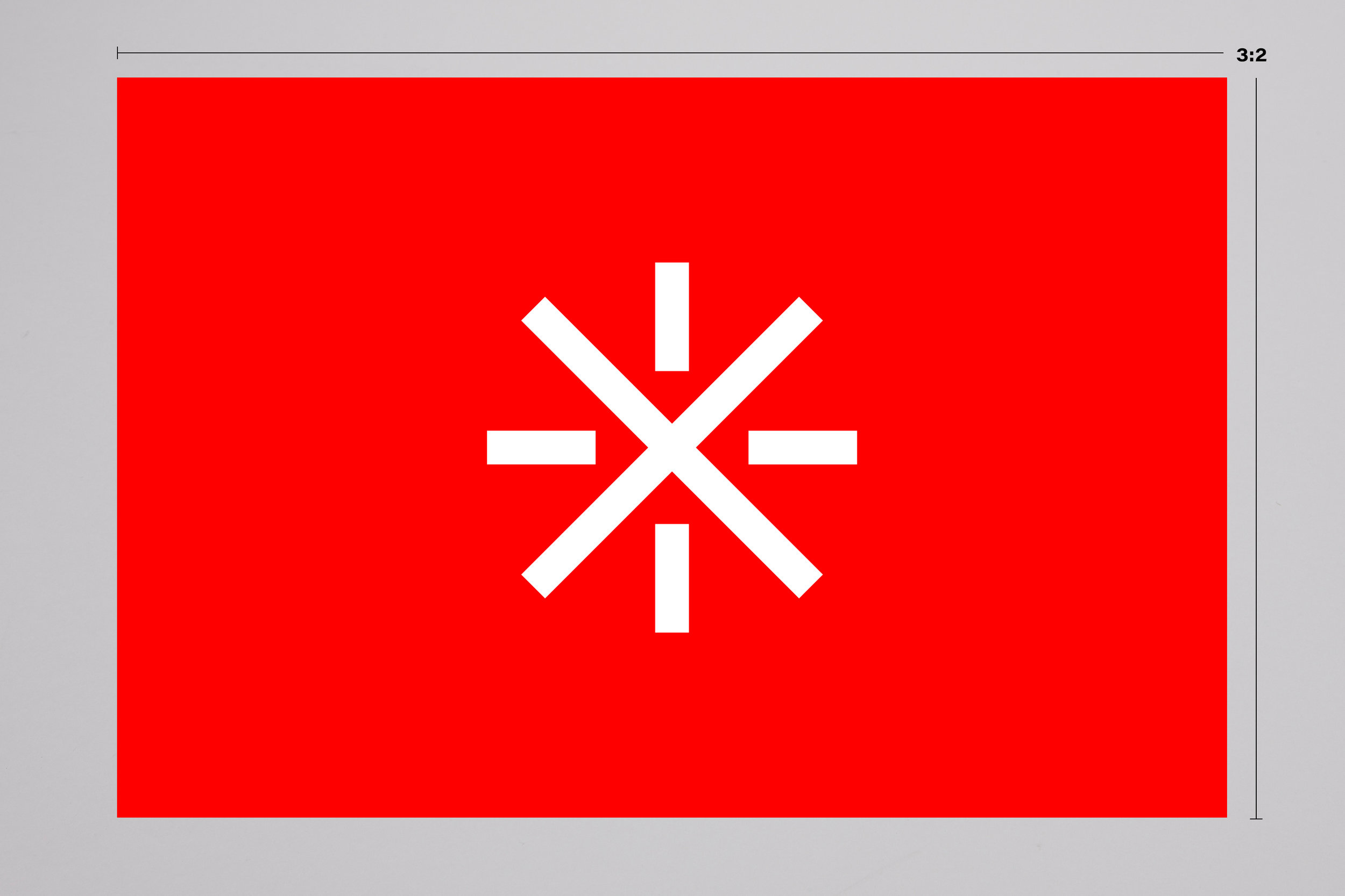
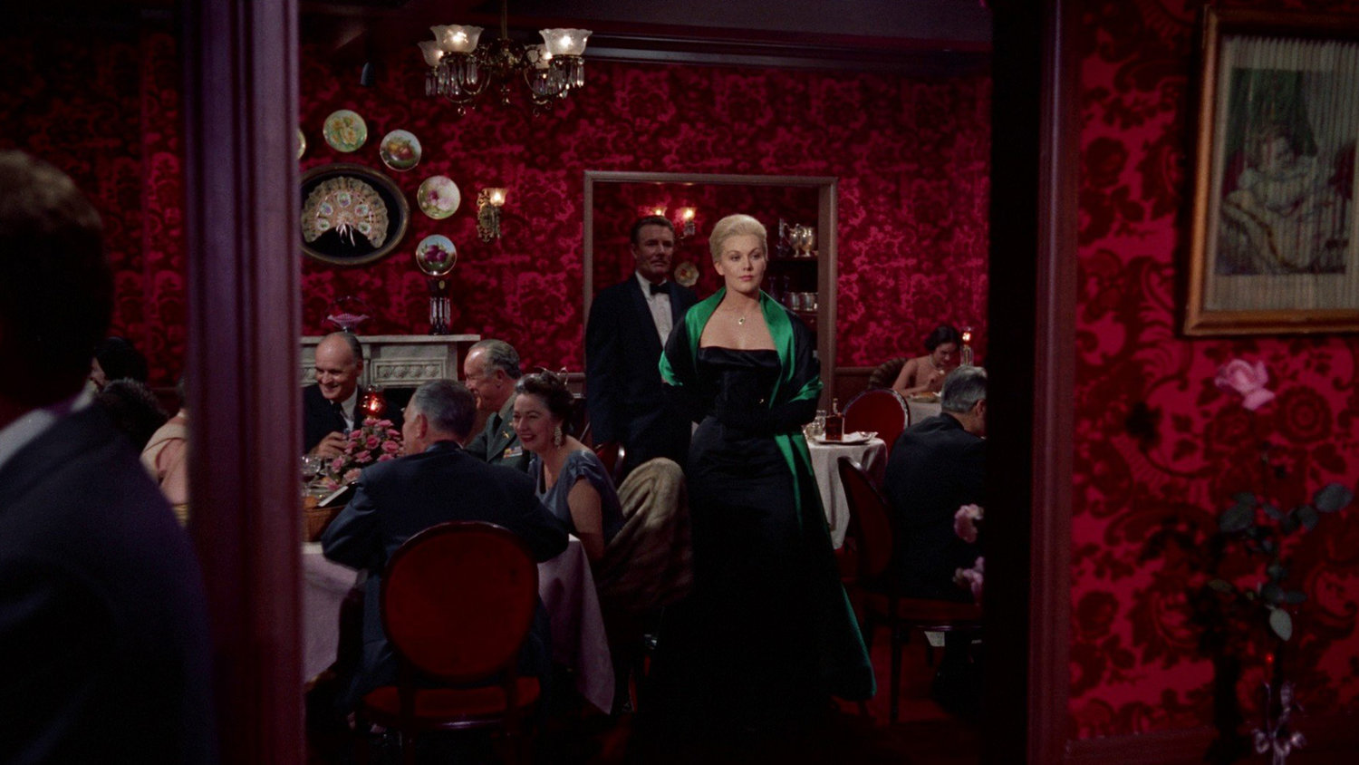
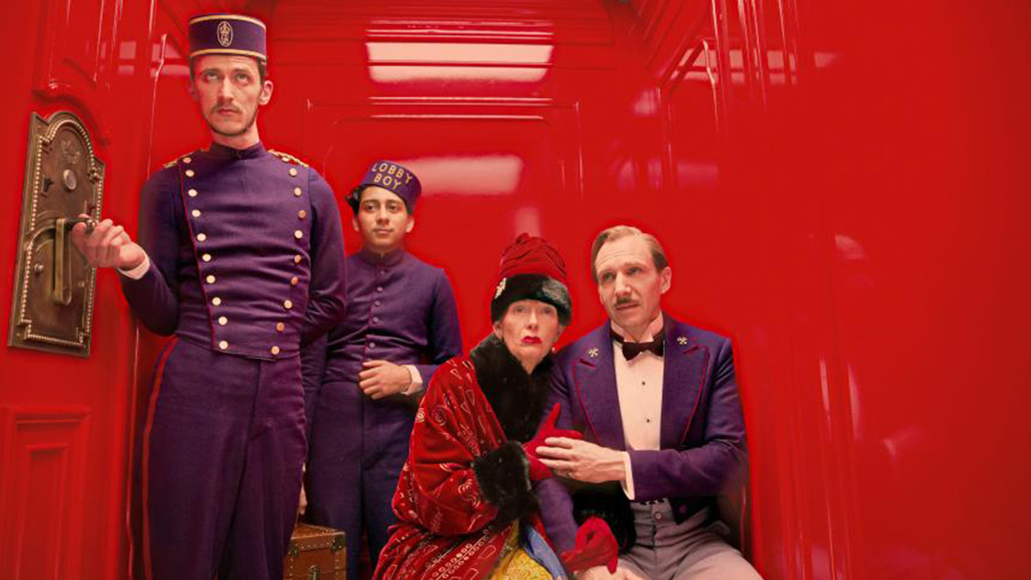
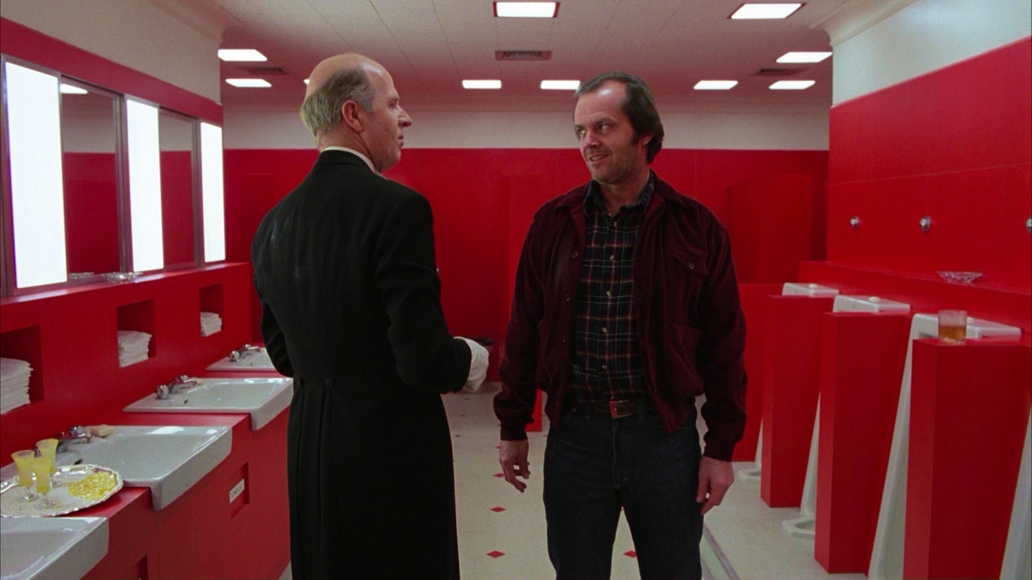
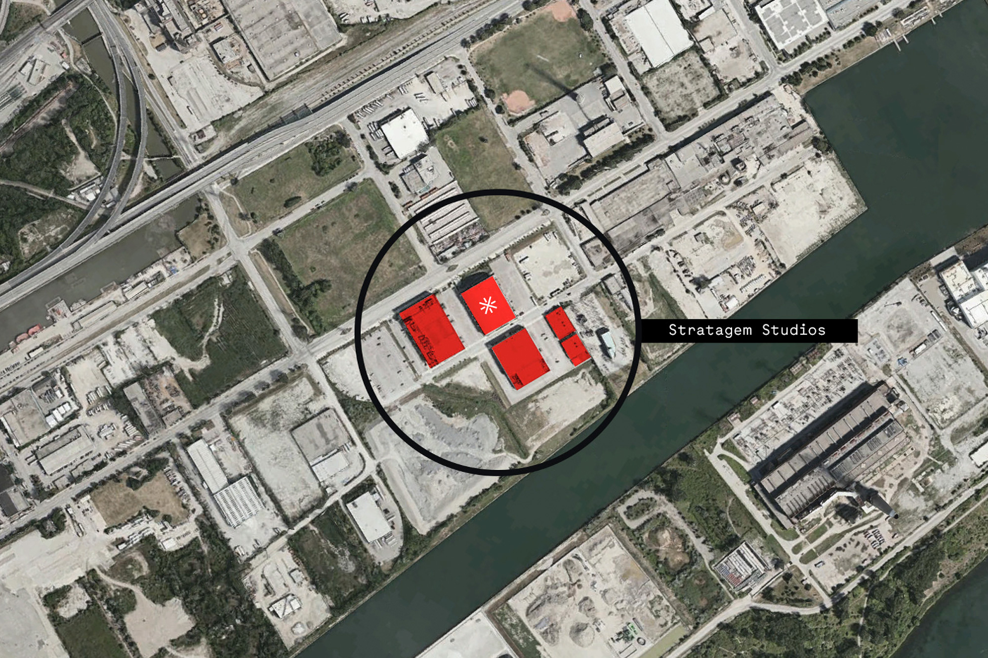
The primary color red is an homage to one of the most defining colors in the film history and a nod to Canada’s national flag.
The branding was designed to behave like its own territorial icon in both small and large ways. Helping establish Toronto and Pinewood Studios as a town that can compete with Los Angeles and New York.
Studio Roof
Other Pieces of Collateral

